[et_pb_section admin_label=”section”][et_pb_row admin_label=”row”][et_pb_column type=”4_4″][et_pb_text admin_label=”Text” background_layout=”light” text_orientation=”left” use_border_color=”off” border_color=”#ffffff” border_style=”solid”]
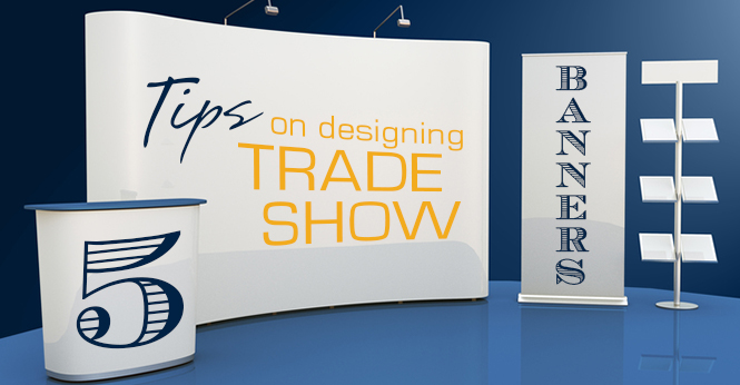
Trade shows can be a zoo! It’s a good thing you don’t have to be the king of the jungle to get a crowd around your exhibit. Just make sure you fan your bright feathers when you set up your trade show display! Dazzle your audience with the right message, appropriate colors, and just enough graphics to get your point across. Here are five tips on designing a trade show banner that will prove to be a show stopper!
1. Your Brand Should Stand Out.
People should be able to recognize who you are from a distance, such as your company name and the service(s) and/or product(s) you offer. The key part of your message should be placed on the top half of your display, as visitors start reading from the top. And since most events are flooded with promotions, the attention span of a visitor is very low towards a single message.
2. Define a Clear Message.
Focus on the most important message you want to deliver. To get started, identify your target audience’s specific needs and purchase motivators.
Pick one clear message to deliver on your trade show banner, and let the rest of your exhibit (attendants, product sample, brochures) communicate the rest of your story. Here are some messages to consider:
a) Uniqueness of product/service or company. What makes you stand out from your competitors?
b) Price. Are you a low price leader in your category? Does your product/service have added value?
c) Customer Service. Do you have a satisfaction guarantee return policy? Does your customer service team go above and beyond to get your clients what they need?
d) Industry Experience. Does your company enjoy the benefits of first mover advantage? How do you measure your experience? Years in business? Clients served? Products sold?
e) Quality. Does your product last longer? Or is it advantageous for its single-use design?
3. Balance Text, Graphics, Color, & White Space.
Make your text crisp, simple and easy to read. Choose san-serif fonts, such as Arial, Verdana, or Gill Sans. Size your text large enough to be easy to read from a distance. Your primary message should be at eye level on the trade show banner. Refrain from using all caps which makes your message disappear in the distance. Instead, use all caps to only highlight key concepts.
Use Graphics. Your trade show banner should have graphics that convey the same clear message. Use images that are easy to interpret. If you are providing a service, use images that relate to the performance of that service; if you are providing a product, use graphics of your product in use.
Splash some color. Use bright bold colors to make your trade show display pop and demand attention. Remember, just a splash. Use sparingly as an accent color, an attention-grabber.
White Space. Don’t forget it! White space (or negative space) is just as important as the graphics you use. Without it, the viewer becomes over stimulated and your trade show banner becomes difficult to read. White space enhances the impact your message creates.
4. Be Consistent.
If you are making a new trade show banner to use with an existing trade show display, it is important to keep a consistent design concept. Consistent design means that your borders, colors, material stay the same. A seamless and consistent design will reinforce your message and brand image.
On the same note, don’t use hand written signs in your exhibit, which will cheapen and take away from your established clear message.
5. Increase Visibility.
You may not have prime real estate at your next trade show. Let’s face it, the extra-large corner exhibit isn’t for everyone’s pocket. To make sure that your exhibit keeps its competitive edge, use soft lighting to illuminate the message on your trade show display to counter fluorescent lights. Keep text to a minimum to reinforce your clear message.
If you are still not sure about implementing these tips, you can always get in touch with a sign expert from our team. We are just a phone call away to assist you with all your signage needs.
[/et_pb_text][/et_pb_column][/et_pb_row][et_pb_row admin_label=”Row”][et_pb_column type=”4_4″][et_pb_cta admin_label=”Call To Action” title=”Get Started on Your Next Trade Show Display or Event Sign” button_url=”https://www.majesticsignstudio.com/get-a-quote/” url_new_window=”on” button_text=”Get Your Free Quote” use_background_color=”on” background_color=”#481b6e” background_layout=”dark” text_orientation=”center” use_border_color=”on” border_color=”#ffffff” border_style=”solid” custom_button=”on” button_text_color=”#000000″ button_bg_color=”#ffd721″ button_border_color=”#ffffff” button_letter_spacing=”0″ button_use_icon=”default” button_icon=”%%40%%” button_icon_placement=”right” button_on_hover=”on” button_letter_spacing_hover=”0″ button_text_size=”18″]
[/et_pb_cta][/et_pb_column][/et_pb_row][/et_pb_section]
