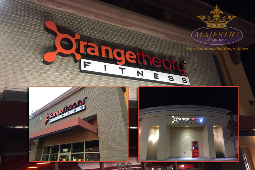
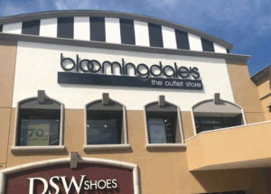
Nothing is worse than struggling to read a sign as you’re driving by and can’t make out the name because the channel letter sign is too small. Don’t let this happen to your business! When it comes to choosing channel letters, size matters. Specifically, when creating channel letter signs ensure you’re choosing the correct letter height and width so that your sign can be easily viewed from a distance.
What’s the best way to ensure that the channel letter signs you’ve spent so much time carefully picking out are effective? The first thing you need to consider is the distance at which you want potential customers to be able to view your sign. Do you want customers that are walking by to be able to see your sign at close range? Are your customers driving by on a nearby roadway, or are they viewing your sign from the highway? Once you’ve determined the general distance from which you expect your sign to be viewed, you can usually begin to determine the letter size needed.
Too Big or Too Small – What Letter Sizing Is Best?
If you aren’t intentional when it comes to the design of your sign, whether it be a frontlit metal sign or halo lit channel letters, the wrong choices for font, color, and sizing will negatively affect your ability to communicate with your audience. Specifically, if the letter size is too small, passersby won’t be able to read it from far away and they’ll pass right by. On the other hand, overly large letter sizing can look awkward and unprofessional.
Halo-lit channel letters, or any type of illuminated letters as well as non-illuminated channel letters signs, are dimensional shapes. This means each letter has a face and a back, usually with a three- to five-inch return connecting the two. To be able to bend and mold the return around the letter means there must be enough space to do so. As such, font choice is critical to how a channel letter is made and at what size.
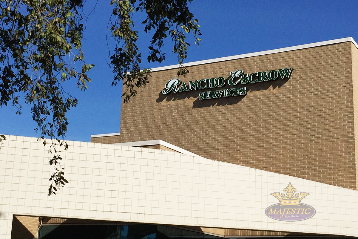
There are several other factors that may affect the overall size choice of channel letters on a sign face, including:
- Font Color and Type – these two selections will send an immediate message about what your brand and business are about. In addition to choosing a font style that’s appropriate for your brand, it’s important to choose one that’s easy to read.
- Sign Placement – Your frontlit metal sign may feature stunning effects and beautiful colors and be in a font visible for miles around – but if it’s placed in a bad location, none of that matters. Your channel letter signs need to be easily visible from nearby roadways and must be tall enough to be seen from a distance and free of any obstructions.
- Illumination – If your sign needs to be visible at night, make sure you choose a lighted design, especially for outdoor business signage. Why spend money on a great sign only to have it obscured by shadows or become completely invisible once the sun sets?
Majestic Sign Studio Can Create The Right Channel Letter Signs For Your Business
As you can see, there is more to creating an effective channel letter sign than you might think. As such, it’s important to work with an experienced sign company who can help you ensure you have the right font, color, style, and letter sizing to help you grow your business. At Majestic Sign Studio, we’ll work with you to create exceptional business signs that create brand awareness and increase your customer base. If your business could use an eye-catching channel letter sign, contact us and let’s get started!
