A Year End Review of Our Client Projects
The beginning of the year is the time when people are making their New Year’s resolutions and reflecting upon notable events of the prior year. For a business, this is further expanded to your business’s current and future plan, your sales through the year and your best projects. Majestic Sign Studio is no different. We went back to review some of our favorite and unique projects that stood out in 2017 that we thought we’d share.
Clairemont Town Square Clock Tower Art Installation
This project is quite unique. We were given photos of an art installation at a shopping center in San Diego. A clock tower had been partially damaged with some pieces destroyed by wind. The damaged pieces were Images of young children that had been hand painted on wood and hung from the tower. The wind had blown them off and broke them into pieces. We were given the challenging task of creating new versions each of the 11 damaged pieces. To compound the challenge, we only had photos of the destroyed pieces after they had been removed from the art installation, to go off of.
After new artwork was created, we printed the new graphics on a large format vinyl printer. Then we applied them to Lexan which is a more durable substrate than wood. We contour cut the Lexan shapes in-house on our CNC router. The new shapes for each child were installed back onto the clock tower and the whole installation looks brand new again.
We think the end result was quite impressive! View other specialty signs we have done for inspiration & ideas!
PCC Aerostructures Multiple Sign Package
This sign & branding package was for PCC Aerostructures. They are a global aerospace manufacturer for whom we did multiple signs for. They enlisted us for two exterior building signs, two directional monument signs, and a custom dry-erase board for their offices. The monument signs consisted of a reface on the existing signs. We added in a new logo and added fresh coats of paint in new colors.
While not a large project, the dry-erase board is a unique one. Often times, people do not realize the scope of what a sign company is able to produce. You’re limited only by your imagination! We created a board with a graphic and their logo superimposed onto it, to be used in their conference room for meetings. To create the “dry-erase” capability, we used an anti-graffiti laminate material to overlay onto the graphic and supporting backer board. This can also be done on clear acrylic for a nice cutting edge and modern look for your office dry-erase board!
Additional options would be to place a background graphic behind your acrylic sign and then offset with standoffs. This could be placed in your board room, for example, and serve as both decorative and functional signage. It creates the look of a semi-translucent 3D image appearance but retains the ability to see what is written on the acrylic.
Reliance Group Interior & Exterior Sign Package
They say you should never “mix your metals”… WE say rules are meant to be broken, as we show here, with the Reliance Group Real Estate Agency. We did the exterior sign in bronze tone cast aluminum letters as was required for this business center. As a counterbalance to the muted tones of the exterior building and signage, the brushed aluminum finish of the interior signs against the rich navy painted wall is striking and attractive.
Corporate Franchise Multiple Sign Package for OrangeTheory Fitness
For this illuminated sign package, a new tenant at “Crossings at Corona” Shopping Center needed two sets of channel letter signs for each side of their building. We created front lit channel letters according to the franchise’s specific branding guidelines. We selected two logo layouts from their guidelines for the front and back side of the building for optimal visual interest. The final result is classy, modern, and eye-catching.
Ajinomoto Corporate Interior Branding Package
Windsor Foods, whose products are sold at Costco and elsewhere, has been a valued client of Majestic Sign Studio for several years. When they merged with Ajinomoto Co., Inc., a Japanese food corporation back in 2015, we got another opportunity to wow them with additional signage not only at their Ontario, CA corporate office but also in Houston, TX.
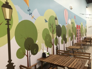
We were thrilled when they enlisted us yet again for another branding sign package that focused on the company’s “core values”. This large project consisted of dimensional signs, wall murals and graphics, inter-office cohesive branding decals, acrylic signs, and conference room glass decals.
Here are some of the other office interior signs we have done for this company in the past!
Awards and Recognitions
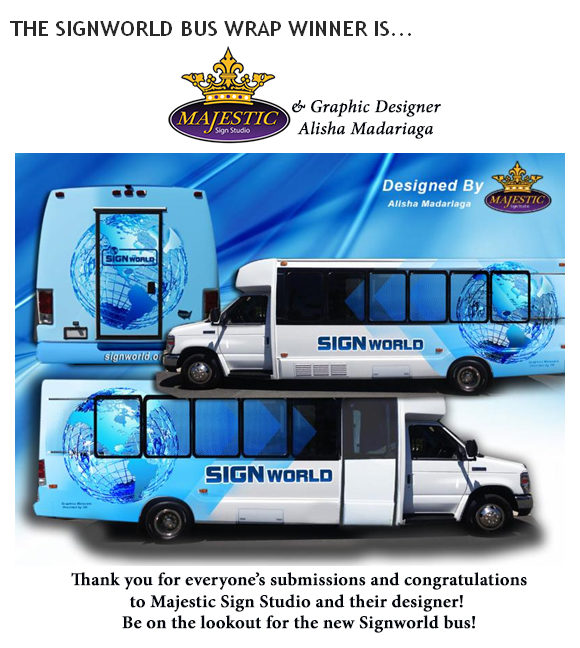
As you can see, Majestic has had a very busy year! In addition to many large projects, we were also recognized for several awards this year. Among them were winning First Place in the Signworld Bus Wrap Competition. Additionally, we took home two awards at our annual sign convention in Las Vegas! We earned Best Vehicle Wrap Design for a mobile pet grooming trailer and Best Business Card Design for none other than our own company!
If you’d like to keep on top of what Majestic is up to, subscribe to our YouTube Channel for new videos of vehicle wrap installations and sign making.
